Sunday, 17 January 2016

Rough cut - Miss Miller


Rough cut

Audience feedback was critically important to our production. This is because when you watch and edit your own production so many times, you can't see the errors. Therefore some feedback from the audience is helpful in order to highlight where the production may need to be changed and edited. Also a rough cut is essential to carry out so that the group can understand how much time, effort and footage we need in order to make a successful production. Our rough cut proved to us that we needed to film more footage as our music video, is hard to follow and understand for the audience. Due to audience feedback we was able to understand that the narrative was not clear, without feedback this we would not be aware of the narrative not being clear.
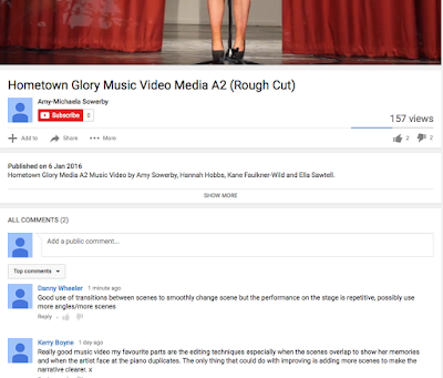

Firstly we received audience feedback from screening our production in class and on youtube. When screening our production in class, the first form of feedback was from our teacher, who outlined how the video was good, but had to much overlapping of shots. Therefore we began to adjust and better our music video. We then showed our music video to peers within the classroom and the feedback was similar to our teachers feedback before. The feedback we received from friends were that the music video was good, but they found difficult to understand without my group explaining the narrative to them. Therefore we went out to film more footage of the friendship, memories scenes. We also received feedback via youtube.
One of the comments on youtube we received suggested that we should include more camera angles on the performance scenes, and to include more scenes as it is repetitive. This constructive criticism is feedback that our group will take on board and use to improve our music video.

Feedback will benefit our production and music industry. Firstly the benefits it will bring to our production is that, we will be able to adjust and adapt our production in order to suit and appeal to our target audience. This will then lead to a more successful production. Using the feedback we will be able to easily identify the sections of our production that need to changed and therefore will make our time more efficient and effective in creating the best possible music video production we can.

Firstly as you can see from the youtube comments, Danny Wheeler gave us a positive and negative comment. To begin the positive comment was how we had good transitions between scenes. After receiving this feedback we ensured that we carried using transitions between scenes when making final adjustments. Danny also gave us negative feedback, which was that our performance scenes were repetitive. This meant that although we had good use of transitions between our scenes, the performance scenes were to often through out the music video therefore as a group, we decided that we need to film some more footage and incorporate a bigger range of scenes into our music video.

Secondly another comment we received was from Kerry Boyne, she also gave us one positive and one negative feedback. The positive feedback was our editing techniques and especially the overlapping of shots. We had also received negative feedback, so this was difficult to take on board and we decided that this editing may be a controversial part of our video and may be liked and disliked. Kerry also left some negative feedback on our music video which was, that our narrative is not very clear. The outcome to improve our work after this feedback is ver similar to Danny's, the outcome is to incorporate more scenes into our music video, in order to make the narrative clearer and overall a more successful music video.

Finally and thirdly another positive comment we received was from Alfie Harris via youtube, The positive feedback was that we had good camera angles, this was due to our group having used the tripod effectively, we then made sure that we kept a range of camera angles when we filmed any more footage. Alfie also left a negative feedback which we had also already received previously, which was that our narrative was unclear. This meant that as a group we had to change and adapt our music video dramatically in order to improve and make our music video narrative easier to understand. Therefore our plan is to film enough footage to include more scenes and clear up the narrative.

In conclusion the feedback we received was very useful to our group in order to make our music video as successful as we could. We have taken on board all feedback constructively to make sure our  target audience can understand and like our music video. Overall this has helped our group make our time more efficient in targeting parts of the music video that need to be changed and adapted in order to succeeded


Monday, 4 January 2016

planning individual magazine advert - Miss georgiou

Planning Individual magazine advert

Planning my magazine advert is important in order to create an attractive and eye catching magazine advert. Initially we planned as a group the common features we would include in our magazine advert. We decided the colour theme would be black and white filter, with some red aspects. This is because these colours connotes conventional aspects of the soul genre. Black and white portraying; sadness and innocence, and red connoting love and desire. We also planned to include a close up on the magazine advert, this was because we researched soul genre artists magazine adverts and a stereotypical representation on the magazine advert was a close up. This is because it is effective in showing the artists thoughts, feelings and emotions. For example in a Adele magazine advert we found the artist hiding half of her face, or looking away towards the floor. This was effective to show that the artist is upset and down. Finally on our white board we ensured that we planned our simple features. So that we include the main information, for example the artist themselves, and the album name.

 When I constructed my magazine advert I took into consideration what we planned as a group, and colour was something I thought was very important. I followed the conventional colours of black, white and red, I also included brown and yellow due to the iconography of the magazine advert; the piano and light. The use of red in my magazine advert is effective in capturing the audience attention. This is because the red dress shows the artist as elegant and professional. Also the red curtains in the background convey the stage type image. This is conventional to the soul genre as it shows the artist as talented, and creates a role model image for the fans. The artist being on stage and looking elegant makes the audience idolises the artist, because they look professional and well dressed. I included a black into the magazine advert through the: chair, inside of the piano, and the artists name 'M' 'Y'. The black in the artists name represents how her past is still effecting her, the letter 'A' is red to show that she is starting to overcome her past, but because the other two letters are black, this shows to the audience that the artist is struggling to forget her dark period of life. This makes the audience feel sympathy and begin to wonder what happened in her past. Therefore the use of black on the font intrigues the audience's attention, and leads to them wanting to purchase the album, to find out what happened in her past life. The black chair represents how the artist is sitting on her past and can not find the strength to stand up and walk away from her past. This is conventional to the soul genre because artists within this genre stereotypical sing about the hard times in their life. The piano having black inside the middle portrays how what the artist is going to playing reflects on her past. This is to let the audience know that the songs in this album are meaningful, and have been constructed by the eventful past of the artist.

I have made my magazine advert conventional to the soul genre because of the location, props and colours I have used within the advert. The location being on stage on her own represents isolation and talented. The use of the piano shows to the artist that she is multi talented, because she can sing and play an instrument at the same time, this is effective in building up her liability of the artist.  Finally the colours included in my magazine advert are also conventional, this is because the black and white filter, represents the artist to be reflecting on her past which is a stereotypical convention of the soul genre. The use of the artist being in the spot light highlights how this album is going to be centred around her, this leads to the audience having an understanding of what is going to be included in the album. This is a conventional aspect of the magazine advert, because artists with in the soul genre stereotypical sing about there struggles and how they have built up to there fame. This then makes it easier for the audience to build up a relationship with the artist, because the audience can see how the artist has been through a lot of hard work to get to the position they are in now.

I think it is essential to include the images of being on stage and having the artist surrounded by a black and white filter in a red dress. As it promotes the artist to be strong-minded and a professional performed. I researched into magazine adverts and found that a stereotypical soul genre magazine advert choice of images would include a close up. I thought by being diverse by using a long shot, but sticking to the conventional aspects of the soul genre makes my advert unique and makes it stand out from the rest. This means that my advert would be eye catching and different so it would be noticed by the target audience, which will lead to the audience being interested and could lead to purchasing the album. Therefore the choice of images I used are effective in relating to the soul genre, but being different to the other soul genre magazine adverts, in order to stand out.

The layout and design of my magazine advert was planned to make the artist look small and over whelmed by the stage aspects. By having massive curtains, a big piano and a long shot of the artist being small in size compared to her surroundings. Makes the artist look vulnerable,  and the audience can get an understanding of how the music industry lifestyle is difficult to handle. Therefore the artist is portrayed as insecure and struggling in the music industry lifestyle, this leads to the audience feeling sympathetic towards the artist and being able to get an understanding of her emotions.


In conclusion I feel it is important to plan and establish soul genre styles and conventional aspects of a magazine advert, In order to capture the audiences eye, and clearly show it is a soul genre magazine. I think the most critical part of this planning was the colours being used, the colours all link in with connotations of the soul genre. The one thing I went against the group ideas on, was the close up. This was because I wanted to include the setting and iconography of a soul genre into my magazine advert, which has made it unique and still very conventional to the soul genre.