Wednesday, 23 March 2016

Friday, 12 February 2016
Wednesday, 10 February 2016
Evaluation - Question 1
Firstly the brief for my task in advanced portfolio was to produce a music video, magazine advert and digipak. A music video is to entertain the audience, promote the artist and also to allow the artist to express themselves. I decided to create a music video in the soul genre using the song 'Hometown Glory' by Adele because I had an understanding that I could create a narrative based video that the audience could relate to, due to the lyrics being deep and meaningful which I could express through a music video. I developed a conventional soul genre music video by following and adapting conventions of the soul genre through various different aspects, for example the use of a black and white filter within my music video to represent the artist reflecting on her past.
Before I could begin to create any of my tasks, I had to carry out sufficient research into the soul genre so that I had a good understanding of what will appeal to my target audience. In order to research I used: macs, google, youtube and blogger. After researching I was able to successfully follow and develop new ideas of the conventions of a soul genre. This was because I had analysed successful soul genre artists such as; Duffy, Paloma Faith and Adele.
 Firstly one of my inspiration to include in my music video was from Adele's music video 'Someone like you' I found the use of a black and white filter which was being used to represent Adele as reflecting on her past, this filter was used throughout the music video. The filter allowed the audience to gain a stronger understanding of Adele, specifically that her past experiences are still having a negative effect on her now. I decided to then incorporate the use of a black and white filter in my music video because the narrative I constructed was developed around my artist being surrounded by fame and losing her friends on the journey. Therefore by including a black and white filter when my artist was reflecting on her past and how she misses her friends, it would make this representation clear and relatable to my target audience, as they would be able to reflect on relationships they have lost over the years. Therefore by using the inspiration from Adele I was able to follow the conventions of the soul genre successfully to create an understandable and relatable convention in my music video.
icongraphy - pictures
performance
Secondly I was inspired by another soul artist Paloma Faith, this was through her music video 'Only love can hurt like this' In this music video I found the use of many close up shots to emphasise the artist emotions and feelings. A specific close up shot that I found in Paloma Faiths music video was at the beginning when she is standing outside in the rain. This close up allowed the audience to clearly identify Paloma's facial expressions of being upset. Which makes the audience question why she is feeling like this engaging to continue watching the video to find out why she's upset.
I then included close ups of my artist, through out my music video to illustrate my artists emotions. A specific example of where I included a close up shot was in the performance scene of my artist on stage singing. This close up showed my artists emotions in a greater depth, the audience were then able to identify that my artist was upset and trying to hold back her emotions in order to sing the song. This helped me to portray my artist as broken, which is conventional to the soul genre because the soul genre is a very emotional genre, therefore the audience are able to gather an in-depth insight to my artists personal emotions and can relate to my artist if they have been through similar circumstances.
 Another convention that I found when researching the soul genre digipak's was the use of non eye contact to the camera. This immediately makes the audience wonder why the artist would not look at the camera, which then leads the audience to believe that the artist is vulnerable and insecure. I then developed this convention into my own digipak, I done this by included a image of my artist not looking at the camera, but then developed the idea by also incorporating an isolated location. This allows my target audience to understand that my artist is insecure, vulnerable, lonely and depressed. All of these representations are key to illustrate to my target audience, because it makes them aware that it is within the soul genre. The representation also suggest to the audience that something or someone is the cause of my artist's pain. Therefore the audience want to find out more about why my artist is down and depressed, which then lead to promote my artists interest and will lead to my target audience watching my music video in order to try and find out more.
I found this convention from the artist Duffy, this was in her music video 'smoke without fire' within this music video the artist, Duffy was in black clothing through out the whole music video, this enabled the audience to be able to understand that the artist was depressed and down, Which therefore allows the audience to build up a relationship with the artist because they are able to understand how the artist is feeling and try to work out why.
The use of black clothing inspired me because it connotations were representations that I wanted to illustrate to my target audience. The connotations of the colour black are: fear, unknown and depression. I then incorporated black clothing into my music video and is present through the majority of my music video because it shows to the audience straight away that my artist is down and depressed, this then leads the audience to question why my artist is feeling like this. this leads to the audience building a relationship with my audience because they want to find more out about why my artist is so upset. Overall the audience will continue to watch the whole music video to try and find the answers to their questions.
Another convention I followed in my music video and ancillaries was the black and white filter effect. The black and white filter connotes reflecting on the past. This is something that I was inspired to do after watching Adele's music video 'someone like you'. The black and white filters are evident in Adele's music video when she is walking down the pathway in Paris. I then decided to incorporate the use of black and white filters on my music video. This is when my artist is playing the piano and reflecting on memories of her friends. I made this using final cut pro x and dragging over the black and white filter on to the footage. I then incorporated the black and white filter on my digipak this is evident in four out of my six sides. I done this on photoshop cs6 and clicked on the black and white filter, then adjusted the opacity and brightness to create the best shade of black and white. The use of the black and white filter allows the audience to build a relationship with the artist, as they begin to get a better understanding on the artists past, and can therefore understanding her deeper feelings and emotions. Which overall makes my artist more relatable to the target audience.
 Another convention I was inspired to use in my music video, was the use of iconography to portray the artist as reflective and regretful.
A music video that I found this inspiration from was 'rolling in the deep' by Adele. Within this music video plates are smashed in order to represent the artists frustration, regret and isolation. I developed this representation into using photographs of my artist with her friends in the past. This allows the audience to gain an understanding of how my artist has lost her friends. Therefore the audience can begin to understand why the artist is so depressed and down overall leading to the audience being able to relate to my artist if they have gone through similar circumstances.
Finally another convention I included in my music video was inspired to me when i watched the music video 'Rehab' by Amy Winehouse. Within this music video the artist has performance scenes where she is singing to the camera. For example when Amy is sitting on her bed with a band in the background. The performance element allows the audience to feel a more personal feel towards the artist and in this case, the audience begin to understand that the artist is surrounded by music as she is performing in her bed. I then decided to include performance elements in my music video. This is evident in the scenes where my artist is on stage singing into the microphone. This makes my artist look professional which the audience look up to and see as a role model. This leads to my artist being idolised, which is important as she is a successful singer, I want to make sure that the audience would want to aspire to be like my artist. Overall the performance convention in my music video promotes the success of my artist.
In conclusion my finished music video and ancillaries successful develop and follow conventions from the soul genre. This is evident as a range of different inspirations lead me to incorporate a range of conventional aspects to my music video and ancillaries. Some of the conventions I had to develop in order to suit my work and make my work more successful. Throughout producing my work I had to keep adapting and changing my work so that all of my work matched the soul genre and matched each other.

Sunday, 17 January 2016
Rough cut - Miss Miller
Rough cut
Audience feedback was critically important to our production. This is because when you watch and edit your own production so many times, you can't see the errors. Therefore some feedback from the audience is helpful in order to highlight where the production may need to be changed and edited. Also a rough cut is essential to carry out so that the group can understand how much time, effort and footage we need in order to make a successful production. Our rough cut proved to us that we needed to film more footage as our music video, is hard to follow and understand for the audience. Due to audience feedback we was able to understand that the narrative was not clear, without feedback this we would not be aware of the narrative not being clear.
 Firstly we received audience feedback from screening our production in class and on youtube. When screening our production in class, the first form of feedback was from our teacher, who outlined how the video was good, but had to much overlapping of shots. Therefore we began to adjust and better our music video. We then showed our music video to peers within the classroom and the feedback was similar to our teachers feedback before. The feedback we received from friends were that the music video was good, but they found difficult to understand without my group explaining the narrative to them. Therefore we went out to film more footage of the friendship, memories scenes. We also received feedback via youtube.
Feedback will benefit our production and music industry. Firstly the benefits it will bring to our production is that, we will be able to adjust and adapt our production in order to suit and appeal to our target audience. This will then lead to a more successful production. Using the feedback we will be able to easily identify the sections of our production that need to changed and therefore will make our time more efficient and effective in creating the best possible music video production we can.
Firstly as you can see from the youtube comments, Danny Wheeler gave us a positive and negative comment. To begin the positive comment was how we had good transitions between scenes. After receiving this feedback we ensured that we carried using transitions between scenes when making final adjustments. Danny also gave us negative feedback, which was that our performance scenes were repetitive. This meant that although we had good use of transitions between our scenes, the performance scenes were to often through out the music video therefore as a group, we decided that we need to film some more footage and incorporate a bigger range of scenes into our music video.
Secondly another comment we received was from Kerry Boyne, she also gave us one positive and one negative feedback. The positive feedback was our editing techniques and especially the overlapping of shots. We had also received negative feedback, so this was difficult to take on board and we decided that this editing may be a controversial part of our video and may be liked and disliked. Kerry also left some negative feedback on our music video which was, that our narrative is not very clear. The outcome to improve our work after this feedback is ver similar to Danny's, the outcome is to incorporate more scenes into our music video, in order to make the narrative clearer and overall a more successful music video.
Finally and thirdly another positive comment we received was from Alfie Harris via youtube, The positive feedback was that we had good camera angles, this was due to our group having used the tripod effectively, we then made sure that we kept a range of camera angles when we filmed any more footage. Alfie also left a negative feedback which we had also already received previously, which was that our narrative was unclear. This meant that as a group we had to change and adapt our music video dramatically in order to improve and make our music video narrative easier to understand. Therefore our plan is to film enough footage to include more scenes and clear up the narrative.
In conclusion the feedback we received was very useful to our group in order to make our music video as successful as we could. We have taken on board all feedback constructively to make sure our target audience can understand and like our music video. Overall this has helped our group make our time more efficient in targeting parts of the music video that need to be changed and adapted in order to succeeded
Monday, 4 January 2016
planning individual magazine advert - Miss georgiou
Planning Individual magazine advert

Planning my magazine advert is important in order to create an attractive and eye catching magazine advert. Initially we planned as a group the common features we would include in our magazine advert. We decided the colour theme would be black and white filter, with some red aspects. This is because these colours connotes conventional aspects of the soul genre. Black and white portraying; sadness and innocence, and red connoting love and desire. We also planned to include a close up on the magazine advert, this was because we researched soul genre artists magazine adverts and a stereotypical representation on the magazine advert was a close up. This is because it is effective in showing the artists thoughts, feelings and emotions. For example in a Adele magazine advert we found the artist hiding half of her face, or looking away towards the floor. This was effective to show that the artist is upset and down. Finally on our white board we ensured that we planned our simple features. So that we include the main information, for example the artist themselves, and the album name.
 When I constructed my magazine advert I took into consideration what we planned as a group, and colour was something I thought was very important. I followed the conventional colours of black, white and red, I also included brown and yellow due to the iconography of the magazine advert; the piano and light. The use of red in my magazine advert is effective in capturing the audience attention. This is because the red dress shows the artist as elegant and professional. Also the red curtains in the background convey the stage type image. This is conventional to the soul genre as it shows the artist as talented, and creates a role model image for the fans. The artist being on stage and looking elegant makes the audience idolises the artist, because they look professional and well dressed. I included a black into the magazine advert through the: chair, inside of the piano, and the artists name 'M' 'Y'. The black in the artists name represents how her past is still effecting her, the letter 'A' is red to show that she is starting to overcome her past, but because the other two letters are black, this shows to the audience that the artist is struggling to forget her dark period of life. This makes the audience feel sympathy and begin to wonder what happened in her past. Therefore the use of black on the font intrigues the audience's attention, and leads to them wanting to purchase the album, to find out what happened in her past life. The black chair represents how the artist is sitting on her past and can not find the strength to stand up and walk away from her past. This is conventional to the soul genre because artists within this genre stereotypical sing about the hard times in their life. The piano having black inside the middle portrays how what the artist is going to playing reflects on her past. This is to let the audience know that the songs in this album are meaningful, and have been constructed by the eventful past of the artist.
I have made my magazine advert conventional to the soul genre because of the location, props and colours I have used within the advert. The location being on stage on her own represents isolation and talented. The use of the piano shows to the artist that she is multi talented, because she can sing and play an instrument at the same time, this is effective in building up her liability of the artist. Finally the colours included in my magazine advert are also conventional, this is because the black and white filter, represents the artist to be reflecting on her past which is a stereotypical convention of the soul genre. The use of the artist being in the spot light highlights how this album is going to be centred around her, this leads to the audience having an understanding of what is going to be included in the album. This is a conventional aspect of the magazine advert, because artists with in the soul genre stereotypical sing about there struggles and how they have built up to there fame. This then makes it easier for the audience to build up a relationship with the artist, because the audience can see how the artist has been through a lot of hard work to get to the position they are in now.
I think it is essential to include the images of being on stage and having the artist surrounded by a black and white filter in a red dress. As it promotes the artist to be strong-minded and a professional performed. I researched into magazine adverts and found that a stereotypical soul genre magazine advert choice of images would include a close up. I thought by being diverse by using a long shot, but sticking to the conventional aspects of the soul genre makes my advert unique and makes it stand out from the rest. This means that my advert would be eye catching and different so it would be noticed by the target audience, which will lead to the audience being interested and could lead to purchasing the album. Therefore the choice of images I used are effective in relating to the soul genre, but being different to the other soul genre magazine adverts, in order to stand out.
The layout and design of my magazine advert was planned to make the artist look small and over whelmed by the stage aspects. By having massive curtains, a big piano and a long shot of the artist being small in size compared to her surroundings. Makes the artist look vulnerable, and the audience can get an understanding of how the music industry lifestyle is difficult to handle. Therefore the artist is portrayed as insecure and struggling in the music industry lifestyle, this leads to the audience feeling sympathetic towards the artist and being able to get an understanding of her emotions.

Planning my magazine advert is important in order to create an attractive and eye catching magazine advert. Initially we planned as a group the common features we would include in our magazine advert. We decided the colour theme would be black and white filter, with some red aspects. This is because these colours connotes conventional aspects of the soul genre. Black and white portraying; sadness and innocence, and red connoting love and desire. We also planned to include a close up on the magazine advert, this was because we researched soul genre artists magazine adverts and a stereotypical representation on the magazine advert was a close up. This is because it is effective in showing the artists thoughts, feelings and emotions. For example in a Adele magazine advert we found the artist hiding half of her face, or looking away towards the floor. This was effective to show that the artist is upset and down. Finally on our white board we ensured that we planned our simple features. So that we include the main information, for example the artist themselves, and the album name.
When I constructed my magazine advert I took into consideration what we planned as a group, and colour was something I thought was very important. I followed the conventional colours of black, white and red, I also included brown and yellow due to the iconography of the magazine advert; the piano and light. The use of red in my magazine advert is effective in capturing the audience attention. This is because the red dress shows the artist as elegant and professional. Also the red curtains in the background convey the stage type image. This is conventional to the soul genre as it shows the artist as talented, and creates a role model image for the fans. The artist being on stage and looking elegant makes the audience idolises the artist, because they look professional and well dressed. I included a black into the magazine advert through the: chair, inside of the piano, and the artists name 'M' 'Y'. The black in the artists name represents how her past is still effecting her, the letter 'A' is red to show that she is starting to overcome her past, but because the other two letters are black, this shows to the audience that the artist is struggling to forget her dark period of life. This makes the audience feel sympathy and begin to wonder what happened in her past. Therefore the use of black on the font intrigues the audience's attention, and leads to them wanting to purchase the album, to find out what happened in her past life. The black chair represents how the artist is sitting on her past and can not find the strength to stand up and walk away from her past. This is conventional to the soul genre because artists within this genre stereotypical sing about the hard times in their life. The piano having black inside the middle portrays how what the artist is going to playing reflects on her past. This is to let the audience know that the songs in this album are meaningful, and have been constructed by the eventful past of the artist.I have made my magazine advert conventional to the soul genre because of the location, props and colours I have used within the advert. The location being on stage on her own represents isolation and talented. The use of the piano shows to the artist that she is multi talented, because she can sing and play an instrument at the same time, this is effective in building up her liability of the artist. Finally the colours included in my magazine advert are also conventional, this is because the black and white filter, represents the artist to be reflecting on her past which is a stereotypical convention of the soul genre. The use of the artist being in the spot light highlights how this album is going to be centred around her, this leads to the audience having an understanding of what is going to be included in the album. This is a conventional aspect of the magazine advert, because artists with in the soul genre stereotypical sing about there struggles and how they have built up to there fame. This then makes it easier for the audience to build up a relationship with the artist, because the audience can see how the artist has been through a lot of hard work to get to the position they are in now.
I think it is essential to include the images of being on stage and having the artist surrounded by a black and white filter in a red dress. As it promotes the artist to be strong-minded and a professional performed. I researched into magazine adverts and found that a stereotypical soul genre magazine advert choice of images would include a close up. I thought by being diverse by using a long shot, but sticking to the conventional aspects of the soul genre makes my advert unique and makes it stand out from the rest. This means that my advert would be eye catching and different so it would be noticed by the target audience, which will lead to the audience being interested and could lead to purchasing the album. Therefore the choice of images I used are effective in relating to the soul genre, but being different to the other soul genre magazine adverts, in order to stand out.
The layout and design of my magazine advert was planned to make the artist look small and over whelmed by the stage aspects. By having massive curtains, a big piano and a long shot of the artist being small in size compared to her surroundings. Makes the artist look vulnerable, and the audience can get an understanding of how the music industry lifestyle is difficult to handle. Therefore the artist is portrayed as insecure and struggling in the music industry lifestyle, this leads to the audience feeling sympathetic towards the artist and being able to get an understanding of her emotions.
In conclusion I feel it is important to plan and establish soul genre styles and conventional aspects of a magazine advert, In order to capture the audiences eye, and clearly show it is a soul genre magazine. I think the most critical part of this planning was the colours being used, the colours all link in with connotations of the soul genre. The one thing I went against the group ideas on, was the close up. This was because I wanted to include the setting and iconography of a soul genre into my magazine advert, which has made it unique and still very conventional to the soul genre.
Tuesday, 15 December 2015
Individual Digipak Analysis - Miss Gourgiou
Individual Digipak Analysis
I created an individual digipak in order to promote my artists album 'Amy18'. Firstly I was influenced and inspired by an artist from the soul genre, because my artist is from the soul genre. I saw Duffy's digipak and instantly I was intrigued into the artists feelings and emotions being displayed, I was connected to these representations due to the artist not making eye contact with the camera, this showed to me and the audience, that the artist is insecure. Insecurity is a typical representation within the soul genre, as the music is based around sadness and depression. Therefore Duffy inspired me to use pictures of my artist not looking at the camera. Due to the quality of the photos I had to include photos where the artist is making eye contact, but I made sure that I included non eye contact photos as well.
Colours
 During my I incorporated a large amount of dull dark colours, such as black white and grey. This was so that it would show to the audience, that the artist is reflecting on her past, as black and white symbolise the past. This will lead to the audience having a better understanding as to, what to expect within the album, which therefore will allow to audience to gain a better understanding of the album 'Amy18'. Overall I believe the dull dark colours will help to appeal my target audience effectively, as they will understand what the connotations of these colours are.
Secondly I have included some red into my digipak. The colour red connotes: danger and love. Both of these connotation are feelings that my artist wants to portray in her album 'Amy18'. Firstly the red shows and represents that the artist has been hurt from a loving relationship. This then leads to the audience having an understanding of how the artist is feeling, if they have gone through similar circumstances, which is likely because the target audience are above the age of sixteen. Therefore the audience can emotionally connect with the artist and then work out if the artist is relating to her family of boyfriend, from listening to the album, overall This will intrigue the audience to purchase the album. Therefore promoting the album.
Conventions of genre
Throughout my digipak I have conformed to the conventions of the soul genre. This has been displayed by the themes and isolation of the artist being portrayed to the audience via my images used. Firstly my colours used are conventional to the soul genre as I mentioned in the paragraph above. I did not want to challenge any conventions of the soul genre, and I wanted to stay conventional to the soul genre, because I wanted my target audience to be able to clearly identify that my digipak was in the soul genre. Therefore I included spotlight effects within my digipak to emphasis the fame and isolation of the artist. This allows the audience to be able to understand how her professionalism has cost her to be isolated from others, this is a theme which other artist within the soul genre also convey through there digipak's, my example being Duffy. Therefor I successfully was conventionally to the soul genre within my digipak, which I believe will appeal my target audience into looking into my artist and what she represents.

Images used
The images I used within my digipak did not all go to plan, as I was going to follow a theme of stage, and curtains within my digipak. But because the front cover did not have any stage like resemblance, it would not have matched my back of the album. Therefore I changed the theme to be a spotlight theme. The images I used did not fully correspond with my planning as I did not use the fifth shot, of the artist outside her school. This was because I wanted to make the most out of photoshop and construct an image that would be unique and more conventional to the soul genre. I included a range of closes up and mid shots and a long shot so that the audience can see the whole artist. The close ups allow the audience to engage and connect with the artist emotionally. I then used the mid shots and long shots of the artist so the audience can begin to idolise the artist, because of her professional look. Overall the images I used were to enable the audience to be able to build up a relationship with the artist in a way, where they can feel connected and also look up to as a role model.
Layout / Design
 The layout and design was a very important element of my Digipak, this was because I constructed a theme of being under the spotlight. Therefore through out my digipak I had to ensure that the designs matched and would match if my album was to be constructed into an actual cd. Digipak being six sides long, meant that create a specific theme that I followed throughout would be difficult, because each slide can not look too similar to another. Therefore I constructed a layout of including my cd within the middle of my digipak to separate the five images used. I then designed the slides using a constructive tools on photoshop. The main tool that is very effective from photoshop is layering. By layering my images and text, I was able to design each slide efficiently to look professional and real.
Typography
The typography used within my digipak is mainly the song names and the artist name. The only other text involved was the 'www.amy18music.co.uk' I added this text in to create a realism of the product, and show to the audience that my artist has fame. The audience can understand this because they can see from her having her own website that she is successful. This leads to the audience building up there likability for the artist and idolising her. Additionally the fonts I used were found from a website called dufont.com. This website had a large range of fonts and enabled me to choose the font that I thought looked the most conventional to the soul genre. The font that the song names are in, helps to show to the audience that they are constructed from her thoughts and feelings. The audience can understand this because the font, looks cloud like, which represents a speech bubble, which connotes her thoughts. Therefore the audience are able to build up an understanding that this digipak is reflecting on her past. Also the text is in white throughout the digipak. Firstly this is due to the dark backgrounds, so the font will stand out and be easily readable. Secondly the colour white represents innocence and shows to the audience that the artist is innocent in the stores that she will be explaining through her music.
Language
 The language I used within the digipak is centralised around the message to fans. The language I use is to make the target audience feel appreciated and to make them feel like the message is personal to themselves. Within the message to fans I use the word 'You' twice. This is so that the audience really feel as though the artist is speaking to them, which is effective in making the audience become a fan of the artist. The audience also feel appreciated as the artist states how 'thankful' she is, and also addresses the audience by her 'dearest friends'. This makes the audience feel loved and taken notice of. also within the message the artist states how she 'could not of done this without you' this is the last line of the message to the fans, and is the most effective in portraying a sense of appreciation to the audience. She highlights that she could not of done this without the support of fans which effectively connotes how the artist may not have the support from friends and family. This leads to the audience being able to understand that the artist feels isolated and money, which therefore makes the audience want to stay connected to the artist to make sure they will be okay. Overall the language used complements the target audience and makes them feel loved and appreciated.
Strengths and Weaknesses of photoshop
My strengths of photoshop are something I found difficult at the beginning attempts of using photoshop, but with practise have become a strength of mine. Firstly The erase tool is now a strength of mine as I have become steady handed, and can erase in a straight line which helps to not cut out the part of the image I need, and also helps in making the edges of the photo look real. Secondly I have been able to successful layer my layers in the order that I needed them to construct a successful soul related image.
On the other hand I found certain tools difficult with photoshop when I first began and still do found them very difficult now. My first weakness is the blur tool. I do not understand how much blur to use in order to make it effectively blurred, without looking ridiculous and fake. After several attempts I either blurred my photos too much or too little, therefore my first and main weakness is the blur tool. Another one of my weaknesses was being able to enlarge my image. I was only able to enlarge my image when I first placed it into photoshop and once I had placed it, could not enlarge it again, this was sufficiently frustrating as I had to keep deleting and re importing my images time and time again.

Conclusion
Overall I believe through my: colours, conventions, images, layout, design, typography and language I have successfully made a conventional digipak that appeals to my target audience. The reasons for my digipak being conventional is because it follows typical representations seen in other soul genre digipak's. These representation are: black and white, isolation, insecurity, personal, relatable, sadness all stereotypical soul representation, which therefore builds up my conventionalism to the soul genre. I also believe that my digipak will appeal to my target audience because it looks professional in the design and way it is played out. I believe the the spotlight theme boosted my appealability and demonstrates to the audience that the artist is new to fame, and is under to spot light on her own, which also connotes the isolation factor. Overall portraying that it is a soul genre digipak.

After receiving feedback from my target audience I adapted and changed my digipak to look more professional and to portray clear representation of my artist that link throughout my ancillaries and music video. One side of my digipak that has changed the most dramatically is the side of the artist standing with the red curtains behind here. The editing, the use of the lasso tool was average in my first attempt and I have now improved the lighting effect to look cleaner and shaper. I have also added text which is lyrics from her song, so that it links with the music video.
I created an individual digipak in order to promote my artists album 'Amy18'. Firstly I was influenced and inspired by an artist from the soul genre, because my artist is from the soul genre. I saw Duffy's digipak and instantly I was intrigued into the artists feelings and emotions being displayed, I was connected to these representations due to the artist not making eye contact with the camera, this showed to me and the audience, that the artist is insecure. Insecurity is a typical representation within the soul genre, as the music is based around sadness and depression. Therefore Duffy inspired me to use pictures of my artist not looking at the camera. Due to the quality of the photos I had to include photos where the artist is making eye contact, but I made sure that I included non eye contact photos as well.
Colours
 During my I incorporated a large amount of dull dark colours, such as black white and grey. This was so that it would show to the audience, that the artist is reflecting on her past, as black and white symbolise the past. This will lead to the audience having a better understanding as to, what to expect within the album, which therefore will allow to audience to gain a better understanding of the album 'Amy18'. Overall I believe the dull dark colours will help to appeal my target audience effectively, as they will understand what the connotations of these colours are.
Secondly I have included some red into my digipak. The colour red connotes: danger and love. Both of these connotation are feelings that my artist wants to portray in her album 'Amy18'. Firstly the red shows and represents that the artist has been hurt from a loving relationship. This then leads to the audience having an understanding of how the artist is feeling, if they have gone through similar circumstances, which is likely because the target audience are above the age of sixteen. Therefore the audience can emotionally connect with the artist and then work out if the artist is relating to her family of boyfriend, from listening to the album, overall This will intrigue the audience to purchase the album. Therefore promoting the album.
Conventions of genre
Throughout my digipak I have conformed to the conventions of the soul genre. This has been displayed by the themes and isolation of the artist being portrayed to the audience via my images used. Firstly my colours used are conventional to the soul genre as I mentioned in the paragraph above. I did not want to challenge any conventions of the soul genre, and I wanted to stay conventional to the soul genre, because I wanted my target audience to be able to clearly identify that my digipak was in the soul genre. Therefore I included spotlight effects within my digipak to emphasis the fame and isolation of the artist. This allows the audience to be able to understand how her professionalism has cost her to be isolated from others, this is a theme which other artist within the soul genre also convey through there digipak's, my example being Duffy. Therefor I successfully was conventionally to the soul genre within my digipak, which I believe will appeal my target audience into looking into my artist and what she represents.

Images used
The images I used within my digipak did not all go to plan, as I was going to follow a theme of stage, and curtains within my digipak. But because the front cover did not have any stage like resemblance, it would not have matched my back of the album. Therefore I changed the theme to be a spotlight theme. The images I used did not fully correspond with my planning as I did not use the fifth shot, of the artist outside her school. This was because I wanted to make the most out of photoshop and construct an image that would be unique and more conventional to the soul genre. I included a range of closes up and mid shots and a long shot so that the audience can see the whole artist. The close ups allow the audience to engage and connect with the artist emotionally. I then used the mid shots and long shots of the artist so the audience can begin to idolise the artist, because of her professional look. Overall the images I used were to enable the audience to be able to build up a relationship with the artist in a way, where they can feel connected and also look up to as a role model.
Layout / Design

Typography
The typography used within my digipak is mainly the song names and the artist name. The only other text involved was the 'www.amy18music.co.uk' I added this text in to create a realism of the product, and show to the audience that my artist has fame. The audience can understand this because they can see from her having her own website that she is successful. This leads to the audience building up there likability for the artist and idolising her. Additionally the fonts I used were found from a website called dufont.com. This website had a large range of fonts and enabled me to choose the font that I thought looked the most conventional to the soul genre. The font that the song names are in, helps to show to the audience that they are constructed from her thoughts and feelings. The audience can understand this because the font, looks cloud like, which represents a speech bubble, which connotes her thoughts. Therefore the audience are able to build up an understanding that this digipak is reflecting on her past. Also the text is in white throughout the digipak. Firstly this is due to the dark backgrounds, so the font will stand out and be easily readable. Secondly the colour white represents innocence and shows to the audience that the artist is innocent in the stores that she will be explaining through her music.
Language
The language I used within the digipak is centralised around the message to fans. The language I use is to make the target audience feel appreciated and to make them feel like the message is personal to themselves. Within the message to fans I use the word 'You' twice. This is so that the audience really feel as though the artist is speaking to them, which is effective in making the audience become a fan of the artist. The audience also feel appreciated as the artist states how 'thankful' she is, and also addresses the audience by her 'dearest friends'. This makes the audience feel loved and taken notice of. also within the message the artist states how she 'could not of done this without you' this is the last line of the message to the fans, and is the most effective in portraying a sense of appreciation to the audience. She highlights that she could not of done this without the support of fans which effectively connotes how the artist may not have the support from friends and family. This leads to the audience being able to understand that the artist feels isolated and money, which therefore makes the audience want to stay connected to the artist to make sure they will be okay. Overall the language used complements the target audience and makes them feel loved and appreciated.Strengths and Weaknesses of photoshop
My strengths of photoshop are something I found difficult at the beginning attempts of using photoshop, but with practise have become a strength of mine. Firstly The erase tool is now a strength of mine as I have become steady handed, and can erase in a straight line which helps to not cut out the part of the image I need, and also helps in making the edges of the photo look real. Secondly I have been able to successful layer my layers in the order that I needed them to construct a successful soul related image.
On the other hand I found certain tools difficult with photoshop when I first began and still do found them very difficult now. My first weakness is the blur tool. I do not understand how much blur to use in order to make it effectively blurred, without looking ridiculous and fake. After several attempts I either blurred my photos too much or too little, therefore my first and main weakness is the blur tool. Another one of my weaknesses was being able to enlarge my image. I was only able to enlarge my image when I first placed it into photoshop and once I had placed it, could not enlarge it again, this was sufficiently frustrating as I had to keep deleting and re importing my images time and time again.

Conclusion
Overall I believe through my: colours, conventions, images, layout, design, typography and language I have successfully made a conventional digipak that appeals to my target audience. The reasons for my digipak being conventional is because it follows typical representations seen in other soul genre digipak's. These representation are: black and white, isolation, insecurity, personal, relatable, sadness all stereotypical soul representation, which therefore builds up my conventionalism to the soul genre. I also believe that my digipak will appeal to my target audience because it looks professional in the design and way it is played out. I believe the the spotlight theme boosted my appealability and demonstrates to the audience that the artist is new to fame, and is under to spot light on her own, which also connotes the isolation factor. Overall portraying that it is a soul genre digipak.

After receiving feedback from my target audience I adapted and changed my digipak to look more professional and to portray clear representation of my artist that link throughout my ancillaries and music video. One side of my digipak that has changed the most dramatically is the side of the artist standing with the red curtains behind here. The editing, the use of the lasso tool was average in my first attempt and I have now improved the lighting effect to look cleaner and shaper. I have also added text which is lyrics from her song, so that it links with the music video.
Monday, 14 December 2015
meetings and schedules - Miss Miller
Meetings and Schedules
Intro
Its is important for my group to meet and have regular discussions on ideas for our music video, so that we can innovate and better our soul genre music video. By having a Schedule where everyone can attend, we are able to fairly have a shared amount of input from each member. This is constructive so that the music video will be based around all of ours ideas, and we be a group and team effort. A music video that is discussed over a long period of time is going to be far better, than a music video that is briefly discussed for ten minutes. Therefore we made sure we organised our time as a group, and let the discussions last as long as they needed to, in order to ensure we all have an understanding of what we are planning on creating.


Conclusion
Overall my group work sufficiently well, we organised and used our time efficiently and we kept changing and bettering our ideas of what we want to include in our music video. In my opinion the whole group gave a fair amount of input to the discussions. We also criticised each other to better the ideas that were not up to the groups standards, for our music video.
It was extremely beneficial to keep note of what we had discussed and planned, because between meetings we forgot certain things we had discussed. Therefore keeping track and record of what we had discussed, also allowed to re-visit what we had already discussed and go over our decisions before moving on, which would take a small amount of time because we had it written down what we had previously discussed in the previous meetings.
Intro
Its is important for my group to meet and have regular discussions on ideas for our music video, so that we can innovate and better our soul genre music video. By having a Schedule where everyone can attend, we are able to fairly have a shared amount of input from each member. This is constructive so that the music video will be based around all of ours ideas, and we be a group and team effort. A music video that is discussed over a long period of time is going to be far better, than a music video that is briefly discussed for ten minutes. Therefore we made sure we organised our time as a group, and let the discussions last as long as they needed to, in order to ensure we all have an understanding of what we are planning on creating.
Conclusion
Overall my group work sufficiently well, we organised and used our time efficiently and we kept changing and bettering our ideas of what we want to include in our music video. In my opinion the whole group gave a fair amount of input to the discussions. We also criticised each other to better the ideas that were not up to the groups standards, for our music video.
It was extremely beneficial to keep note of what we had discussed and planned, because between meetings we forgot certain things we had discussed. Therefore keeping track and record of what we had discussed, also allowed to re-visit what we had already discussed and go over our decisions before moving on, which would take a small amount of time because we had it written down what we had previously discussed in the previous meetings.
Thursday, 10 December 2015
individual magazine advert analysis

Individual magazine advert
The individual magazine advert was created to promote and show to our audience the style and genre of our artist. The purpose of having a magazine advert is so that my target audience, can gain some knowledge about my artist, which will lead them to want to find out more, therefore leading to my target audience wanting to get hold of the album itself, which is my digipak. My magazine advert was made on photoshop and my theme was low-key / spotlight. This is because I planned to use this sort of theme within my digipak, therefore making the digipak recognisable from the magazine advert.
Firstly the colour scheme I used was low key for the actual image itself, and white and red font colours. The low key contrast with the white and red fonts, makes the fonts more visible and stand out more. The use of the low key helps my font colours to be extremely noticeable. But the main purpose of my magazine advert being low key and dark is to make it conventional to the soul genre. Low key lighting is frequently used within soul genre music videos, this inspired me to incorporate the use of the low key colour into my magazine advert. I want the audience to be intrigued to pick up my magazine advert, by having the low key contrast, it connotes representation such as: isolated, down, sad, insecure, lonely. By the audience understanding these representation, it makes the audience want to find out why the artist feels this way. Therefore the low key colour helps to appeal my target audience to pick up my magazine advert and find out more about the artist. The white font suggests innocence, because the artist name is in white it suggest that she is innocent and surrounded by the low key contrast, tells the audience that the innocent artist is surrounded by negative and sad feelings. Finally the red font colour used within my magazine advert symbolises love. This shows to the audience that the artist is either looking for love, or has been hurt by love. Therefore this appeals to the target audience to buy her album, so they can workout if she is looking for love or has been hurt because of love.
My magazine is conventional to the soul genre and also promotes my artist style effectively. The use of all my colours, layout, image used and typography are all very typically soul genre like. If you look at a similar artist such as Adele you can see in the comparison that her magazine adverts are focused oh her facial expression, via a close up. This helps the audience to understand the artists emotions and feelings. Within the soul genre the audience are looking for ways to connect and build relationships with the artist, therefore my magazine illustrates many ways that the audience are able to relate to and build a relationship with the artist. Also having the five stars on the front appeal the audience to listen to her music as she is rated at the top level, this is a key way to promote my artist and effectively entice the target audience.
The image used within my magazine advert is a close up. I used a close up so that my audience could easily relate to the artist herself, the close-up is engaging, this is because the artist is making eye contact with the camera, which creates a personal feel for the audience as they feel as though the artist is looking at them. Therefore I chose to use this image because it intrigues and interests audience. Also due to the artist covering part of a face it suggests that the audience that she is vulnerable and insecure about her appearance this leads to the audience getting an understanding of how the artist feels emotionally and physically therefore the image helps the audience to gain a better understanding of the artist herself which leads to the audience feeling more relatable and overall building up a relationship with the artist.
The layout and design was structured on photo shop I trialed and errored a few different ways to place the title Amy 18. In the end I decided to use all the text below the bottom half of the magazine this was so the spotlight was clearly above Amy and shows that she is in the limelight. This was done so the audience could clearly understand that our artist is professional and has fame. The positioning of all the text in the bottom half of the magazine advert was also so it was easily readable this is because the background is much darker down the bottom half of the magazine advert, which meant the text would stand out more and have a greater effect on intriguing the target audience.
The typography I used was based on research into other so genre magazine adverts I found out from my research, that other soul genre magazine adverts tend to use capitals and bold fonts. Therefore I chose this typography off of dufont.com as it has a soul genre look to it. Amy 18 being my title I chose to make this font the largest, and also the most sharp look to it, this was so the audience would be able to understand that the artist is professional and someone to idolise and look up to. It was made the largest so that it would stand out amongst the other fonts. The same font I used for Amy 18 I used for 'winter exclusive featuring' this was so the magazine advert had similar fonts within it so that it looks to a professional standard.
The language I used within my magazine advert was stereotypical language that you would see on any magazine advert for example 'winter exclusive featuring' this was also a subtitle from a real magazine advert that I found in my research. I also included a slogan 'from the backstage to the limelight Amy Sowerby revealed' this was so the audience would be intrigued and interested into how my artist has risen into her fame. By the audience being absorbed by this, the audience will then want to find out more about the artist, this will lead to the audience getting the digipak.
During my use of photoshop I came across several difficulties, with the tools and how to use photoshop itself. Firstly the layering format on photoshop was confusing, this was because previously to this task I had not used photoshop. Also the blurring tool, which is meant to be used to hide any erase-ments that are not perfect. When I used the blur tool I either blurred to much and had to start again, or didn't blur enough. Overall Practice makes perfect and I believe that is all you can do with photoshop, as the more you use it, the more you become comfortable with the tools and ways of photoshop. As I did throughout creating my magazine advert over the space of a couple of hours.
The positives of using photoshop are the range of tools that you have to edit your images and fonts. There are so many different ways to add filters, colours, layers and more so easily. Photoshop helps to make the magazine advert to a professional standard. The main strength of photoshop is the layering, this is because you can hide parts of your font or images behind others. It is such a simple thing to do yet is so effective in making your magazine advert look good.
 Overall I think my magazine advert is very conventional to the soul genre as I have discussed through my paragraphs on colour, conventions, images, layout, typography and language I used. But overall its conventions are that the artist is seen as insecure and vulnerable, which are two key representations within the soul genre. These representations help to connect the artist to the audience in a symphatic way. Making the audience feel sorry for the artist. I believe the target audience would be appealed by my magazine advert because it is conventional and due to the five star rating of the artist, the audience will be appealed to listen to her music.
Based on the feedback I received from my target audience. I changed and adapted my magazine advert to suit the music industry. The feedback I received was that my magazine advert was looking more like a thriller magazine advert. Therefore I took this onboard and removed the low key lighting and the brightness and contrast filters, that were effectively making the advert dark and gloomy. I then changed the colour of some of the fonts from red to white, so they are more effective and visible.
During my use of photoshop I came across several difficulties, with the tools and how to use photoshop itself. Firstly the layering format on photoshop was confusing, this was because previously to this task I had not used photoshop. Also the blurring tool, which is meant to be used to hide any erase-ments that are not perfect. When I used the blur tool I either blurred to much and had to start again, or didn't blur enough. Overall Practice makes perfect and I believe that is all you can do with photoshop, as the more you use it, the more you become comfortable with the tools and ways of photoshop. As I did throughout creating my magazine advert over the space of a couple of hours.
The positives of using photoshop are the range of tools that you have to edit your images and fonts. There are so many different ways to add filters, colours, layers and more so easily. Photoshop helps to make the magazine advert to a professional standard. The main strength of photoshop is the layering, this is because you can hide parts of your font or images behind others. It is such a simple thing to do yet is so effective in making your magazine advert look good.
 Overall I think my magazine advert is very conventional to the soul genre as I have discussed through my paragraphs on colour, conventions, images, layout, typography and language I used. But overall its conventions are that the artist is seen as insecure and vulnerable, which are two key representations within the soul genre. These representations help to connect the artist to the audience in a symphatic way. Making the audience feel sorry for the artist. I believe the target audience would be appealed by my magazine advert because it is conventional and due to the five star rating of the artist, the audience will be appealed to listen to her music.
 Based on the feedback I received from my target audience. I changed and adapted my magazine advert to suit the music industry. The feedback I received was that my magazine advert was looking more like a thriller magazine advert. Therefore I took this onboard and removed the low key lighting and the brightness and contrast filters, that were effectively making the advert dark and gloomy. I then changed the colour of some of the fonts from red to white, so they are more effective and visible.
Photo Shoot - Miss gourgiou
Photo Shoot
During filming we was asked to take photos of our artist. The photos would help the group to construct a Digipak each. There had to be a range of different photos because we all can't have the same digipaks, therefore as a group we got together a range of seventy photos that each group member had to pick six for their own individual Digipak. It was essential that a variety of photos were taken to ensure that our digipaks didn't look the same or follow the same theme. We began taking photos in the hall, with a stage setting, we also took a lot of photos in the London setting, and finally photos were taken in Amy's house. This gave the group a variety of photos to choose from, which was important so we did not end up copying each other.

 The reason we took this particular photo is because it is very conventional to our genre. Close ups are commonly used in the soul genre, this photo Amy focused on the camera so that our audience would be able feel connected with the artist. This picture was intended to be used within the digipak, which it is on my front cover. I cropped out the background and added a spotlight effect, this is because I am following a spotlight theme throughout my digipak. The image is conventional to the soul genre, especially for a front cover. Looking at the other soul genre cd covers you can see a similarity in most of them, this is the close up on the front cover. The reason it is used, is so that the audience can engage with the artist. I think this particular image is good because the artist is in focus and the background is not, therefore it will be easier for me to easier the background on Photoshop. It is also good because the artist looks to be hiding her emotions, this will give the audience a sense of interest as they will want to find out more about the artist. Overall I think the audience will be able to build up a relationship with the artist because it is a close up, so the audience feel personally connected and can see the artist feelings and emotions, which leads to the audience being able to understand the artist, therefore building up a relationship.

 Secondly this image was taken in a similar location to the first one. This particular image was taken for either the digipak or magazine advert. Once deciding on a different photo for my magazine advert, I used this photo for the background of my track list side of my digipak. This picture is conventional of the soul genre and was taken after inspiration from Duffy's digipak, who is a successful soul genre artist. Within her digipak she does not look at the camera. Not looking at the camera creates a insecurity feel about the artist and this a stereotypical representation within the soul genre. The good features about this photo is that the artist is wearing black which matches the connotations of not looking at the camera. These connotations suggest: depression, insecurity and down. These representations will help the audience to understand how the artist is feeling, this will aid in the audience being able to build up a relationship with the artist.

 Thirdly this image was taken because we knew as a group we would need a large amount of close ups of the artist, therefore this was one of many. This picture was intended for the magazine advert, and I used it as a magazine advert as you can see. The close up is conventional to the soul genre as it is relatable and intriguing for the audience, which leads to the audience wanting to find out more about the artist. In this particular image, because the artist is holding her coat up above her chin, it suggests that she is cold. Therefore I was able to construct this image into a Winter magazine advert, which helped me choose a background, and decide the theme of both the advert and digipak. I think that this image will firstly be effectively engaging to the audience because it is a close up. But secondly very easily identifiable of what genre the magazine is. The soul genre consists of many close ups, but this close up with the coat pulled up, really portrays to the audience that she is an individual and connotes that she is on her own. Therefore the audience can build up a relationship with the artist from this image, because they are able to gain a greater understanding of how the artist may be feeling lonely and insecure. These connotations are clear to the audience through the use of hiding parts of her face.


 Finally this particular image was taken in the school hall, and was used to create the professionalism and stage look. This was intended to be used for my magazine advert, but actually is now being used for my digipak. This is conventional to the soul genre because the artist is isolated which the audience can understand that the artist is professional but insecure. I think the good aspects of this image is because the artist is looking down which also connotes how the artist is insecure. Finally the audience are able to look up to the artist as a role model, because she looks professional. Therefore the audience are able to build up a relationship because they idolise the artist and are intrested in her fame.
In conclusion I thought as a group our photo taking at the beginning didn't go to well, as we did not have enough good ones to split between the group. Once Amy and Ella went London they managed to get another seventy photos. This lead to our digipak's all having original features. I feel as though the close ups and long shots in the school hall, I did particularly well with the positioning of the camera, and the red curtains being shut. The overall best part of our photos were all the close ups, this is evident as the close ups were the most used by all the members of our group. The representation of the photos overall portray a sense of: down, insecure, vulnerable, basically all typical soul genre representations. This was so our digipak and magazine adverts were conventional as possible.
During filming we was asked to take photos of our artist. The photos would help the group to construct a Digipak each. There had to be a range of different photos because we all can't have the same digipaks, therefore as a group we got together a range of seventy photos that each group member had to pick six for their own individual Digipak. It was essential that a variety of photos were taken to ensure that our digipaks didn't look the same or follow the same theme. We began taking photos in the hall, with a stage setting, we also took a lot of photos in the London setting, and finally photos were taken in Amy's house. This gave the group a variety of photos to choose from, which was important so we did not end up copying each other.

 The reason we took this particular photo is because it is very conventional to our genre. Close ups are commonly used in the soul genre, this photo Amy focused on the camera so that our audience would be able feel connected with the artist. This picture was intended to be used within the digipak, which it is on my front cover. I cropped out the background and added a spotlight effect, this is because I am following a spotlight theme throughout my digipak. The image is conventional to the soul genre, especially for a front cover. Looking at the other soul genre cd covers you can see a similarity in most of them, this is the close up on the front cover. The reason it is used, is so that the audience can engage with the artist. I think this particular image is good because the artist is in focus and the background is not, therefore it will be easier for me to easier the background on Photoshop. It is also good because the artist looks to be hiding her emotions, this will give the audience a sense of interest as they will want to find out more about the artist. Overall I think the audience will be able to build up a relationship with the artist because it is a close up, so the audience feel personally connected and can see the artist feelings and emotions, which leads to the audience being able to understand the artist, therefore building up a relationship.
 Secondly this image was taken in a similar location to the first one. This particular image was taken for either the digipak or magazine advert. Once deciding on a different photo for my magazine advert, I used this photo for the background of my track list side of my digipak. This picture is conventional of the soul genre and was taken after inspiration from Duffy's digipak, who is a successful soul genre artist. Within her digipak she does not look at the camera. Not looking at the camera creates a insecurity feel about the artist and this a stereotypical representation within the soul genre. The good features about this photo is that the artist is wearing black which matches the connotations of not looking at the camera. These connotations suggest: depression, insecurity and down. These representations will help the audience to understand how the artist is feeling, this will aid in the audience being able to build up a relationship with the artist.
 Thirdly this image was taken because we knew as a group we would need a large amount of close ups of the artist, therefore this was one of many. This picture was intended for the magazine advert, and I used it as a magazine advert as you can see. The close up is conventional to the soul genre as it is relatable and intriguing for the audience, which leads to the audience wanting to find out more about the artist. In this particular image, because the artist is holding her coat up above her chin, it suggests that she is cold. Therefore I was able to construct this image into a Winter magazine advert, which helped me choose a background, and decide the theme of both the advert and digipak. I think that this image will firstly be effectively engaging to the audience because it is a close up. But secondly very easily identifiable of what genre the magazine is. The soul genre consists of many close ups, but this close up with the coat pulled up, really portrays to the audience that she is an individual and connotes that she is on her own. Therefore the audience can build up a relationship with the artist from this image, because they are able to gain a greater understanding of how the artist may be feeling lonely and insecure. These connotations are clear to the audience through the use of hiding parts of her face.
Fourthly, this image was taken in the London location, this was because within our music video we included a variety of clips within the London area. Therefore this image was taken to bring in some of the music video aspects into our magazine adverts or digipak. This particular photo was not targeted to be used in the magazine advert or digipak. We thought that it could be used for either, however I incorporated this image into my digipak. This is because I thought that this image is conventional to the soul genre, and because of it being conventional the target audience would be able to recognise that this digipak is within the soul genre. I think the good aspects of this image, are the facial expressions and body language of they artist. The connotations of the facial expressions and body language, suggest that the artist is confused and worried this leads to the audience being able to relate and build up a relationship with the artist.
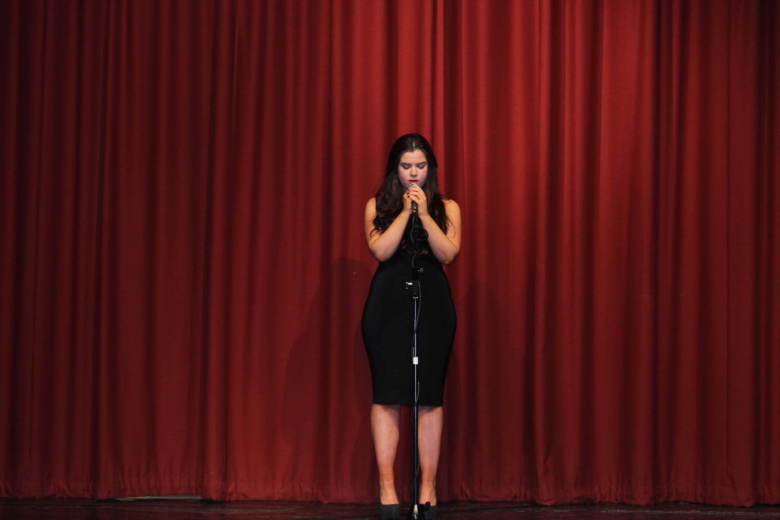
 Finally this particular image was taken in the school hall, and was used to create the professionalism and stage look. This was intended to be used for my magazine advert, but actually is now being used for my digipak. This is conventional to the soul genre because the artist is isolated which the audience can understand that the artist is professional but insecure. I think the good aspects of this image is because the artist is looking down which also connotes how the artist is insecure. Finally the audience are able to look up to the artist as a role model, because she looks professional. Therefore the audience are able to build up a relationship because they idolise the artist and are intrested in her fame.
In conclusion I thought as a group our photo taking at the beginning didn't go to well, as we did not have enough good ones to split between the group. Once Amy and Ella went London they managed to get another seventy photos. This lead to our digipak's all having original features. I feel as though the close ups and long shots in the school hall, I did particularly well with the positioning of the camera, and the red curtains being shut. The overall best part of our photos were all the close ups, this is evident as the close ups were the most used by all the members of our group. The representation of the photos overall portray a sense of: down, insecure, vulnerable, basically all typical soul genre representations. This was so our digipak and magazine adverts were conventional as possible.
Thursday, 3 December 2015
Planning Digipak - Miss georgiou
Planning Digipak

 The language I Incorporated into my soul genre digipak, was planned and used effectively in my message to the fans. The message clearly uses the word 'You' this is so that the message becomes personal for the target audience. This is important so the fans feel as if the artist is really aiming the message at themselves, this makes the audience feel more involved and can therefore build up a relationship with the artist as they can relate more. Using language so the audience get a personal feel from the artist, ensures that the audience can connect to how the artists feels and therefore can build up and increase the artist like-ability.
A Digipak contains higher quality and more meaningful images. The digipak also usually contain a personal message from the artist which is aimed directly at the fans, which gives a more personalised feel towards the fans from the artist, it also can contain a bonus track and
is six sided.
The difference between a digipak and a jewel CD is that the digipak contains: further promotions of the artist within the extra sides available. This allows the target audience to be able to build up a relationship with the artist and connect to the artist emotions and expressions, this is because with six sides, I am able to include relatable and conventional images for example: The artist isolated outside her school, which the audience can then gain an understanding that the artist feels vulnerable, therefore through the six sides, I can build a successful conventional digipak that the audience will be able to understand and relate to. I carried out research into other soul genre artist digipak's and found; Duffy's digipak. Within Duffy's digipak I found out that the representations that are clearly shown through the six sides are mainly sad and upset representations. These connotations are shown through the artist facial expression and body language. Duffy is not facing the camera within her digipak, this inspired me to include a side where the artist would not be looking at the camera, which connotes to the audience that artist is insecure. I will also include the artist looking upset through the body language. The side where I showed my inspirations from Duffy is side five, where my artist is outside her old school. This is because I used the idea of not looking at the camera to emphasize the artists insecurity and depression. Planning is important to carry out before creating a digipak, so that I can identify the stereotypical connotations and themes showed through a soul genre digipak, and then either adapt, follow, develop of challenge the conventions I find to make my digipak unique and successful. .
Firstly I decided to use the black and white colour theme within my digipak. I was inspired to do this from Duffy's digipak, because her digipak is in black and white and clearly sets the theme of her style of music involved in this album. I used black and white because it immediately portrays the past, and the past is something I want to portray through my digipak, because the artist is reflecting on her past through out her music.Therefore including a black and white filter, immediately illustrates to the audience that my artist will be reflecting on her past, this will interest the audience as they will be able to find out why the artist is down and depressed.
I also included some red in my digipak. The reasons behind incorporating red within my digipak is to show to the audience, that the artist is still looking for love within her life, in both her family and personal life. This makes the audience feel sympathetic towards the artist, because the artist is being represented as broken and disconnected from her family, through out our music video. Therefore it links in with the use of black and white filter as the red will engage the audience to be able to identify that the artist is trying not to dwell on her past anymore, and looking to the future to make her life better. The colors also allow the audience to identify that the digipak is in the soul genre.
I also included some red in my digipak. The reasons behind incorporating red within my digipak is to show to the audience, that the artist is still looking for love within her life, in both her family and personal life. This makes the audience feel sympathetic towards the artist, because the artist is being represented as broken and disconnected from her family, through out our music video. Therefore it links in with the use of black and white filter as the red will engage the audience to be able to identify that the artist is trying not to dwell on her past anymore, and looking to the future to make her life better. The colors also allow the audience to identify that the digipak is in the soul genre.
Due to the album and songs involved conventional being about the artists past. I included an image of the artist sitting on the floor outside of her old school. This illustrates to the audience that the artist is reflecting on her past. Due to the artist on the floor and upset it emphasises how the artist misses her secondary school life. The audience then begin to get an understanding of how the artist is struggling within the music industry, and how she wishes she could go back to her old life, therefore making the artist look vulnerable and tired of the busy stressful, music industry lifestyle. Overall convey a background on the artist that the audience are able to understand and build a relationship with.
The layout of the digipak is important so that it is effective in intresting the target audience. The six sides are spread out between images, a message to the fans, the cd itself, the song list and the front cover. In order to catch the audiences attention, I have used the two extra sides I had left over and used conventional and relatable images to show to the audience that it was a soul genre digipak. I also used these images to convey a theme of sadness and fame combined to show to the audience how it can be stressful and hard for the artist. This is emphasised in the image of the artist sitting outside her old school, upset. This image connotes how the artist misses her normal life at secondary school and all her friends, and is now depressed and down. The audience can then relate and build up a relationship with the artist by getting a clearer understanding of how she has got caught up in a busy fame lifestyle and has no friends supporting her anymore. Which represents a stereotypical convention in the soul genre of being vulnerable and down, therefore I plan to develop on the conventions of the soul genre and dress the artist in dark colour clothing, e.g. black to ensure the representation of depression and sadness is clear to the audience. This is so the audience will begin to feel sympathetic towards the artist, and will then build up a relationship with the artist because they will want to find out more, as to why she is down and depressed.
The typography I decided to use was fancy on the actually CD, this font was used to show to the audience that the artist is elegant and professional. It is important to emphasies these representations to the audience so that they will then idolise and look up to the artist as a role model. Professionalism is key to show through the typography, this is so that the audience can identify the artists fame, and will lead to the audience buying the digipak, because of its professionalism. Also the rest of the typography used was bold and simple, this was done so that the audience can easily read the text and don't get put off by fancy font being over used.
Also the use of the bold and clear fonts are so that the, the font that is fancy is more personal to the artist as it represents hand written text. Therefore in my message to fans I am going to use the fancy font, this will give a more personal effect and make the artist more engaging.
Also the use of the bold and clear fonts are so that the, the font that is fancy is more personal to the artist as it represents hand written text. Therefore in my message to fans I am going to use the fancy font, this will give a more personal effect and make the artist more engaging.
 The language I Incorporated into my soul genre digipak, was planned and used effectively in my message to the fans. The message clearly uses the word 'You' this is so that the message becomes personal for the target audience. This is important so the fans feel as if the artist is really aiming the message at themselves, this makes the audience feel more involved and can therefore build up a relationship with the artist as they can relate more. Using language so the audience get a personal feel from the artist, ensures that the audience can connect to how the artists feels and therefore can build up and increase the artist like-ability.
Also the personal effect makes the audience turn from the target audience to a fan, as once the target audience feel like they have made a connection with the artist, they begin to follow and have a bigger interest in the artist.
In conclusion I now have a much better understanding of how I will structure my actually digipak and what photos I need to include with in it. I think from doing this task it had broadened my understanding of digipak 's and how they should be constructed. I will make sure that within my group we take more than enough photos, so that if I decide not to use some of the photos, I would have an alternative. Also from planning this digipak I have encountered more knowledge on the soul genre, this was due to researching other artists digipak. I think I will now be able to make a successsful digipak that my audience will be able to relate to.
Thursday, 19 November 2015
Risk Assessment - Miss Miller
Risk Assessment
The purpose of creating and having a risk assessment is to identify the possible risks that may injure the team when filming. By identifying the risks I can come up with solutions to lower the chance of the risk actually happen. Therefore by coming up with not just one but two ways to ensure the risk does not occur. I am preventing the group from being in danger or getting hurt when filming, which is important for all our health. I identified six risks that could occur when filming at our chosen locations these are: rain getting on them camera, falling of the stage, getting lost in London, moving the piano, filming in the dark and trailing leads. These are all the possible risks that could occur when we film out music video.


Our risk assessment was stuck to and helped sufficiently in ensuring everybody's health and safety. We followed our risk assessment through out filming especially when we filmed in the hall. The trailing leads of the microphone were wrapped around the microphone stand so that the leads were out of the way and out of any danger. The risk of falling off the stage was prevented by each member watching out for each other, when they were near the edge of the stage. For example I was told a few times to be careful as I was near the edge. This was effectively making me aware of how close I was to the edge and stopped me from getting any closer and falling off. We did not encounter any further risks when filming, this shows that we planned our risk assessment sufficiently and carefully. Overall the risk assessment raised everyones awareness in the group of the possible risks that could happen, and therefore prevented them when we came to film, as we was all aware and more careful in everything we did when filming.
Friday, 13 November 2015
Filming schedule - Miss Miller

Filming Schedule


Filming schedule is important to have so that each day of filming is as efficient as it can be. With the filming schedule we have numbed the shots that we will do in order (e.g 1,2,3,4,5...), we also set out the date and time so it is clear to every group member what day and time we should meet. This leads to less confusion and making more use of the small time scale that we have to film. We also state the location that we will be filming each shot, identify the location, shows to the group where to meet. The next section is content/action this part is constructed to make the group aware of what we are planning on filming, which scene or shots we want to get done in that day. The next box is the shot type and duration, this is essential to plan so that we don't forget our ideas on what we thought would be effective in incising the target audience. The next box is costume/hair/makeup This box is mainly aimed at our artist, Amy. So that she knows what to wear on each day, this is because we have included three different outfits through out our music video. The next box is iconography this box will asset the group in getting the correct iconography for the correct day of filming. Personnel basically outlines who is being filmed, as you can see the majority of the days it is all Amy which we can rely on. The one day we need friends included in the shot, we have to ensure they are all free and available, which will be planned in advance. Finally the last box is equipment which reminds the group what equipment we need on each day that we film. Overall the filming schedule is very important to have so that each and every day of filming is clear to the group on everything we need and when and where to meet. This means that we will have no confusion and effectively good filming days from good preparation.
In conclusion the filming schedule was very useful. We didn't actually follow the order, but that has been down to the group having difficulties in meeting, the availability of the hall in school or the weather. But the order of the filming schedule is not to important as long as we have the other boxes of information, which aided us of what we need on each location. For example numbers 7,8,9 is when we planned to film a city location, due to having the cameras early and while we was off school, the group filmed this scene first, so the dates on the filming schedule are incorrect as these scenes were filmed earlier than the 29th. This benefited the group as this gave the group footage to start editing while we waited for the availability of the rooms in school, for example the hall and music rooms.
The hall and music room scenes when the artist is either playing the piano or performing, we filmed extra shots. This is because we thought as a group that we would rather have more to edit, rather than not enough. Therefore filming extra shots gave us security in for filling the whole four minutes of the song. Overall the information that is essential in this filming schedule has been used each time we filmed, the only issue with the filming schedule was the dates we planned, but this had no impact on the filming as we just re arranged and filmed exactly what we planned.
Music video inspiration - miss miller
Music video inspiration
I am going to analyse three music videos and pull out three aspects that have inspired me and could possibly use in my own music video. I will be focusing on: micro elements, music video style, artist representation, music video genres, theory, choice of song and more. The three music videos i am going to use will be music videos that i have already looked at before in previous posts. The music videos are: Tears dry on their own- Amy Winehouse,
Tears dry on their own - Amy Winehouse
During this music video of Tears dry on their own, The artist walks down a busy high road, but she walks like no one else is there. The audience can see this by the way Amy doesn't look at anyone and sometimes bumps into people because she is unaware that they was there. This is conventional to the soul music genre as it highlights the theme of isolation. As in many soul genre music video the artist is usually alone and portrays how they need no one. The way Amy is around the public but does not interact with anyone suggests to the audience that she does not need or want to speak to anyone. Therefore is on her own and emphasis the concept of isolation. This has inspired me to use this in my music video, because we have planned to film
 part of the music video in the busy city of London. Therefore when we film the London shots it will be conventional to the soul genre if she copies the way Amy Winehouse walks down this high street. oblivious to everyone around her
.Someone like you - Adele
 During the music video someone like you, by Adele. The editing style used through out the whole music video is a black and white filter. The filter represented how the artist is reflecting on her past. This helps the audience to understand the song and the artists emotions. Therefore I am going to plan on incorporating a black and white filter on my music video, because it is conventional and effective in capturing the audiences attention and incising them into the music video. The black and white filter has inspired me to use it within mine, because throughout my music video the artist is reflecting on the past, very similar to how this music video is using the black and white filter.
 During the music video 'Only love can hurt like this' by Paloma Faith. The use of close ups are used effectively to convey the artists emotions and feelings. I was inspired by the close ups in this music video because they were full of realism and clearly showed to the audience how much the song meant to the artist. I think that within my groups music video using close ups, will help to build up a relationship between the artist and the audience. During the song the part where the artist sings 'I just crumble' the close up effectively conveys the artists weakness and insecurities, which are conventional aspects to the soul genre. Therefore I am planning on conveys the same traits in my soul genre music video.
Lay me down - Sam Smith
 Throughout the the music video 'Lay me down' by Sam Smith. The use of low key lighting is extremely conventional to the soul genre music videos. It also helps to set the tone of the music video immediately. The low key lighting expresses to the audience the artists emotions and mood to the audience. This allows the audience to build up an understanding of how the lyrics connote a story about something that has happened to the artist previously. I have been inspired by the low key lighting within Sam Smiths music video, and I plan to use the lighting effect within my groups music video. The use of low key lighting being present in my music video will illustrate to the audience that the mood of the song will be sad and meaningful to the artist.
 During the music video Adele 'hometown glory' I was inspired by the use of cinematography included in the music video. Tracking and panning were so effective in This music video to keep the music video exciting and not boring for the target audience. In my group I will make sure that we use tracking and panning in the scenes that the artist is playing the piano and on stage. This will give the audience all different angles of the artist making the artist more relatable and connectable for the audience. I also believe it keep our music video entertaining and to a professional standard .
I am going to analyse three music videos and pull out three aspects that have inspired me and could possibly use in my own music video. I will be focusing on: micro elements, music video style, artist representation, music video genres, theory, choice of song and more. The three music videos i am going to use will be music videos that i have already looked at before in previous posts. The music videos are: Tears dry on their own- Amy Winehouse,
Tears dry on their own - Amy Winehouse
During this music video of Tears dry on their own, The artist walks down a busy high road, but she walks like no one else is there. The audience can see this by the way Amy doesn't look at anyone and sometimes bumps into people because she is unaware that they was there. This is conventional to the soul music genre as it highlights the theme of isolation. As in many soul genre music video the artist is usually alone and portrays how they need no one. The way Amy is around the public but does not interact with anyone suggests to the audience that she does not need or want to speak to anyone. Therefore is on her own and emphasis the concept of isolation. This has inspired me to use this in my music video, because we have planned to film
 part of the music video in the busy city of London. Therefore when we film the London shots it will be conventional to the soul genre if she copies the way Amy Winehouse walks down this high street. oblivious to everyone around her
.Someone like you - Adele
 During the music video someone like you, by Adele. The editing style used through out the whole music video is a black and white filter. The filter represented how the artist is reflecting on her past. This helps the audience to understand the song and the artists emotions. Therefore I am going to plan on incorporating a black and white filter on my music video, because it is conventional and effective in capturing the audiences attention and incising them into the music video. The black and white filter has inspired me to use it within mine, because throughout my music video the artist is reflecting on the past, very similar to how this music video is using the black and white filter.
Only love can hurt like this - Paloma Faith
 During the music video 'Only love can hurt like this' by Paloma Faith. The use of close ups are used effectively to convey the artists emotions and feelings. I was inspired by the close ups in this music video because they were full of realism and clearly showed to the audience how much the song meant to the artist. I think that within my groups music video using close ups, will help to build up a relationship between the artist and the audience. During the song the part where the artist sings 'I just crumble' the close up effectively conveys the artists weakness and insecurities, which are conventional aspects to the soul genre. Therefore I am planning on conveys the same traits in my soul genre music video.
Lay me down - Sam Smith
 Throughout the the music video 'Lay me down' by Sam Smith. The use of low key lighting is extremely conventional to the soul genre music videos. It also helps to set the tone of the music video immediately. The low key lighting expresses to the audience the artists emotions and mood to the audience. This allows the audience to build up an understanding of how the lyrics connote a story about something that has happened to the artist previously. I have been inspired by the low key lighting within Sam Smiths music video, and I plan to use the lighting effect within my groups music video. The use of low key lighting being present in my music video will illustrate to the audience that the mood of the song will be sad and meaningful to the artist.
Adele - hometown glory
(Music video)
 During the music video Adele 'hometown glory' I was inspired by the use of cinematography included in the music video. Tracking and panning were so effective in This music video to keep the music video exciting and not boring for the target audience. In my group I will make sure that we use tracking and panning in the scenes that the artist is playing the piano and on stage. This will give the audience all different angles of the artist making the artist more relatable and connectable for the audience. I also believe it keep our music video entertaining and to a professional standard .
Subscribe to:
Posts (Atom)